
AUTUMN
Boosting discovery for a grief support platform
Timeline
Timeline
Jun - Aug 2024
Jun - Aug 2024
Role
Role
Product Designer
Product Designer
Team
Team
1 founder
1 product designer
2 product managers
2 developers
1 founder
1 product designer
2 product managers
2 developers
skills
skills
Product design
User research
Prototyping
Product design
User research
Prototyping
Overview
Autumn connects people with end-of-life service providers to help them navigate bereavement.
During my internship, I designed a library resource to engage users earlier, and more frequently.

Project results
19%
increase in site clicks
12%
conversion from the Support Library to the main product
10/12
users felt inclined to revisit Autumn in the future
Problem
End-of-life services like Autumn face a unique challenge: users only need them once, during life's most sensitive moments.
Low-Frequency Marketplace Challenges
1
Limited opportunities to build relationships with potential users
2
Difficulty building brand awareness and trust before moment of need
3
Reduced data collection opportunities for product iteration
4
Traditional user retention metrics don’t apply
This understanding led us to ask:
How might we create meaningful connections with users beyond our core service?
Understanding the market
Let’s take a look at what others are doing to tackle this challenge.

Key Finding
Successful low-frequency marketplaces create auxiliary content/tools that provide value outside their core product.
Adding user touchpoints
We wanted to engage users earlier in their bereavement journey, before the crisis moment.


Design challenge #1
Users were not clicking to the provider pages from the Support Library articles
Initially, users had to navigate to a separate provider page after reading articles, creating unnecessary friction in the user journey. Click-though rates on these sections were extremely low.
Solution
I transformed these basic CTAs into provider preview cards that showcase available professionals, directly integrated within the article content.


This revamped section includes:
Embedded relevant provider profiles directly within articles
Created contextual recommendations (e.g., showing estate lawyers in legal planning articles)
Added direct contact options within the content
This change made the providers discoverable, and created a more natural path to Autumn’s main product.
Design Challenge #2
With limited content initially, the full platform felt empty and bloated at launch
Solution
Autumn needed to launch quickly for New York users while building a foundation that could scale nationally. I split the knowledge hub design into several phases that could be introduced gradually as the platform grew.
Phase 1 (launch): Core functionalities
Phase 2 (scale): Expanding the features
All content streamlined into one landing page. A bare bones site, suitable for minimal content.

Support Library Landing
All articles, sorted by category

Call to action

Phase 1 (launch): Core functionalities
Phase 2 (scale): Expanding the features
All content streamlined into one landing page. A bare bones site, suitable for minimal content.
Support Library Landing
All articles, sorted by category
Call to action
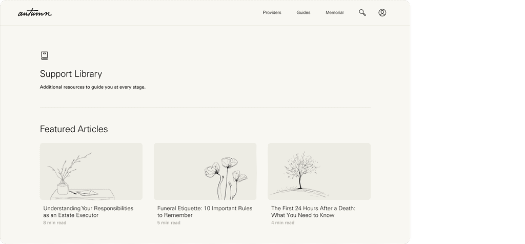
The Final Product
Introducing the Autumn Support Library
It's done! What did I learn?
Ruthless prioritization > doing it all
Daniel Shaw, Autumn's founder, taught me that in an early-stage startup, there are a million and one things to work on, improve, and fix at all times. Progress in this environment comes from putting on "blinders," choosing a single priority, and channeling all efforts into that focus.
Balance quick wins with long-term foundations
Working on a multi-stage project taught me that on top of knowing what to build, I had to know WHEN to build it. I learned to map designs on a timeline, distinguishing what must exist now, what can wait, and what foundations need to be laid today for future success.
Don’t wait for perfect data, use what you have
Without access to traditional user research, I studied successful low-frequency marketplaces like Zillow instead. I discovered that good design insights often come from connecting existing dots in creative ways.


